LCCM UX/UI Redesign
ABOUT THE PROJECT
There’re some features that don’t work well on the mobile version, and the User Interface could be more developed. The improvement will enhance and personalize the customer experience, and also will benefit their brand image.
-
We asked some of our users why they are inquiring our courses, and what kind of things they were looking for when searching for a school creative media. Our simple design no combalidate the product and the interface should be one of the selling points. Also, our product catered for most of their needs without being overly complicated. Based on the feedback, our new website design will reflect on those points, both from the content and visual style.
After summarizing the research, I have developed the following considerations:
Home Page Information was outdated and the design language didn’t reflect the current brand.
Menu Bar It’s difficult to navigate through the site and it’s time to reform and signify what less or more important.
Search feature It should have better controls and functions to help users identify trusted merchants and authenticity.
Courses feature Should have been more organized and be one of the main features. Students enroll in courses to try them out, but do not intend to invest time in completing them.
-
Updated branding and restyle the existing LCCM website. Much of the functionality, such as course search and filtering.
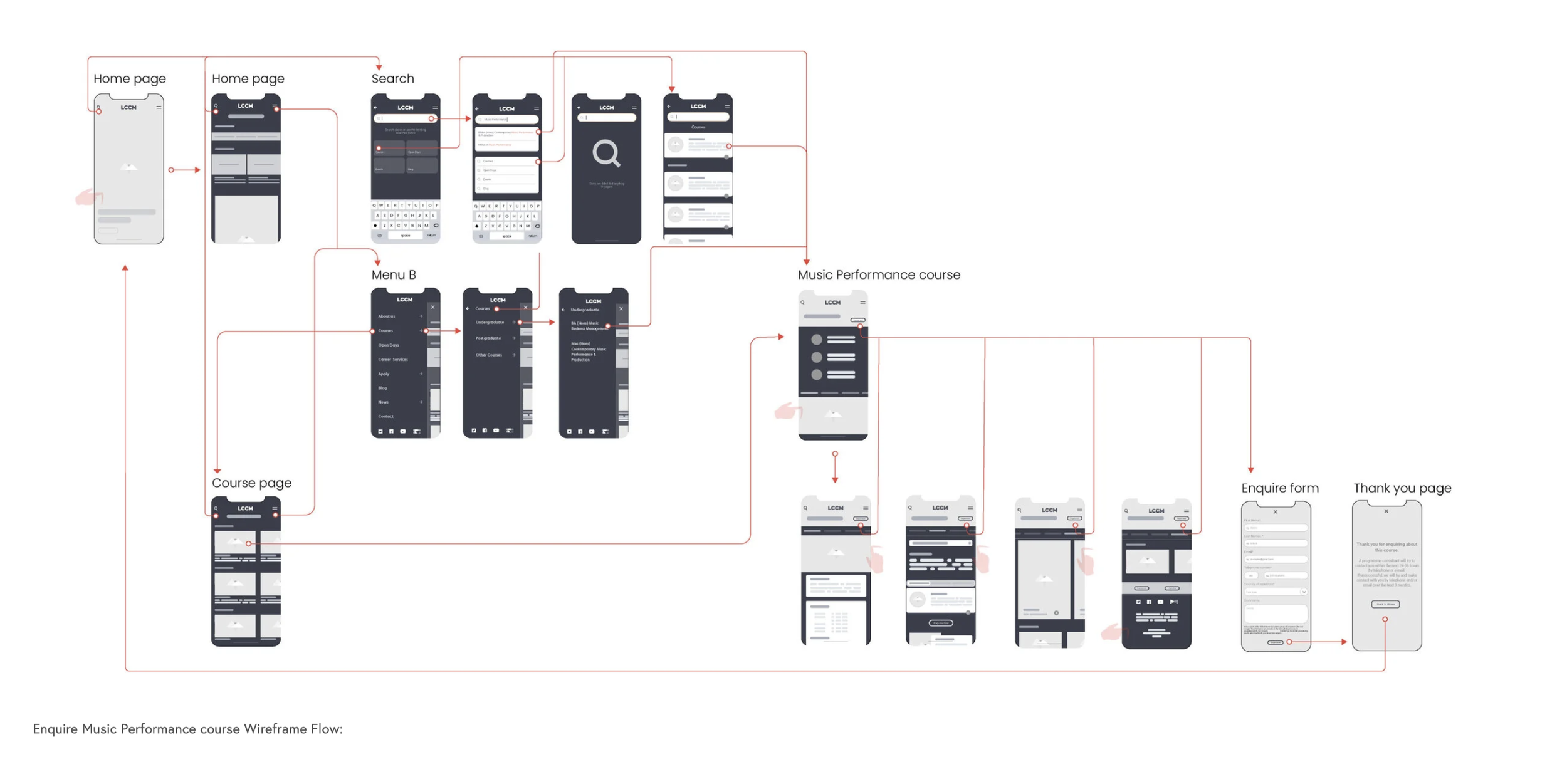
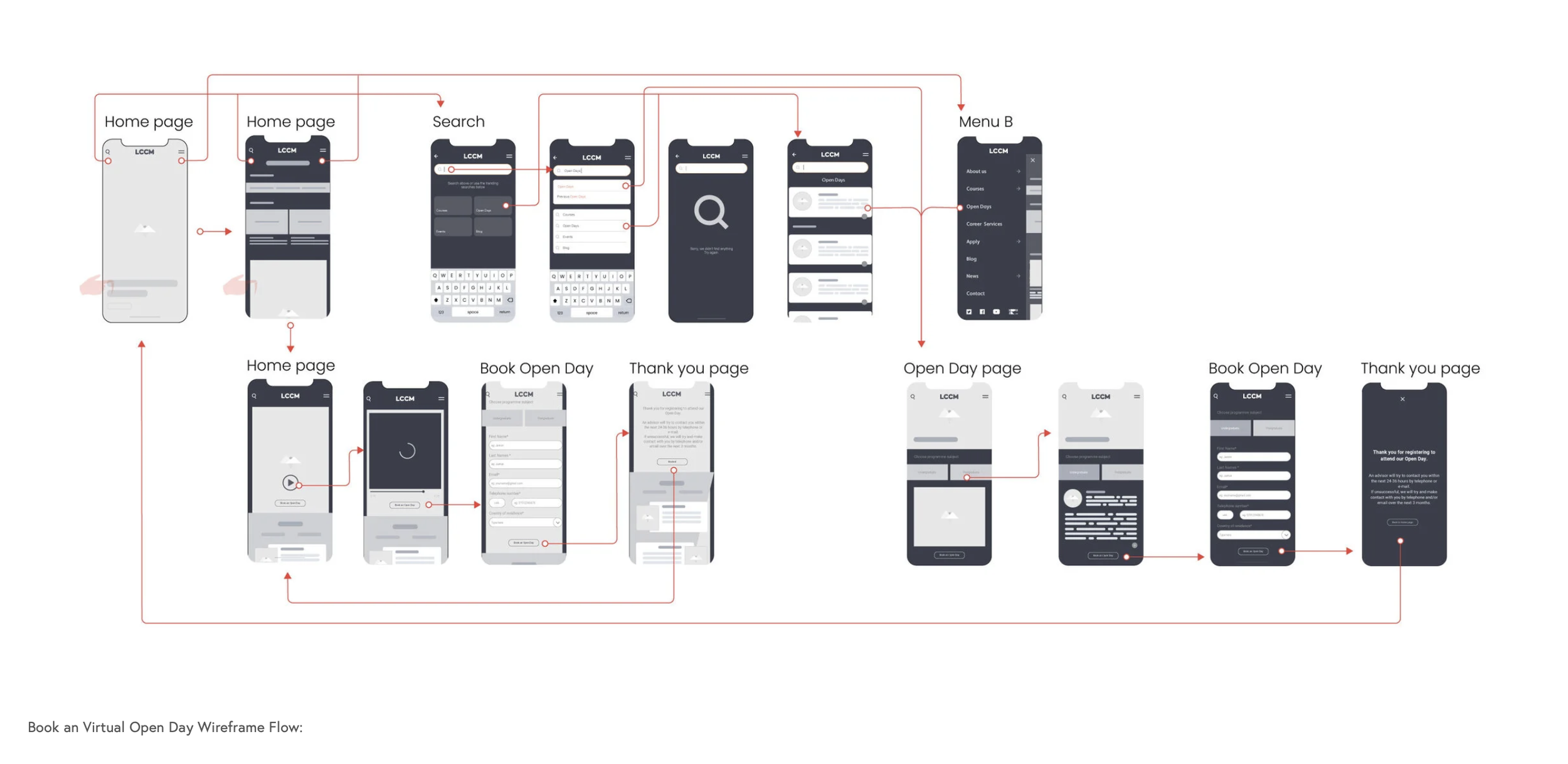
Website architecture user journer needs refinement due to the targeted nature of LCCM applicants and streamlining of courses.
Modernised design language home page and course pages. Led to a re-platforming effort to make visual changes quicker and easier to implement.
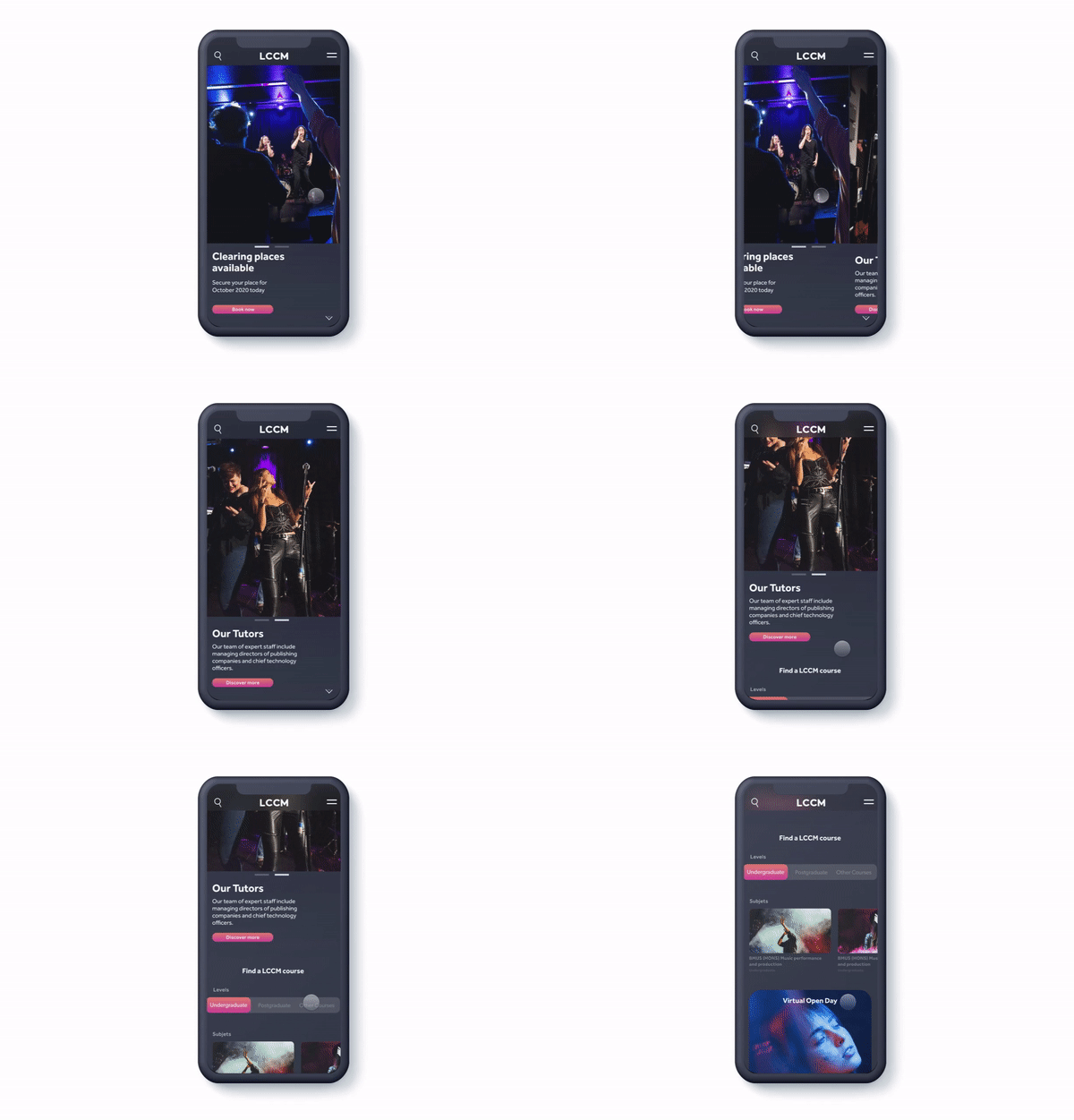
RAPID RETRIEVAL WITH A SIMPLER HOME
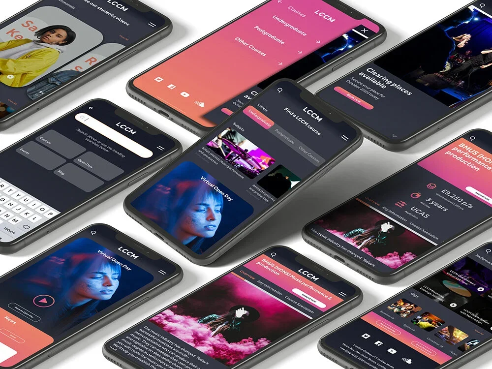
Through testing and crunching analytics, I discovered users actually used Home mainly to access to courses and the recents events such Performance and gigs. The new design of home refocuses the experience around recents and creates a more scalable layout for other features through use of a tabbed menu.
MENU
BURGER
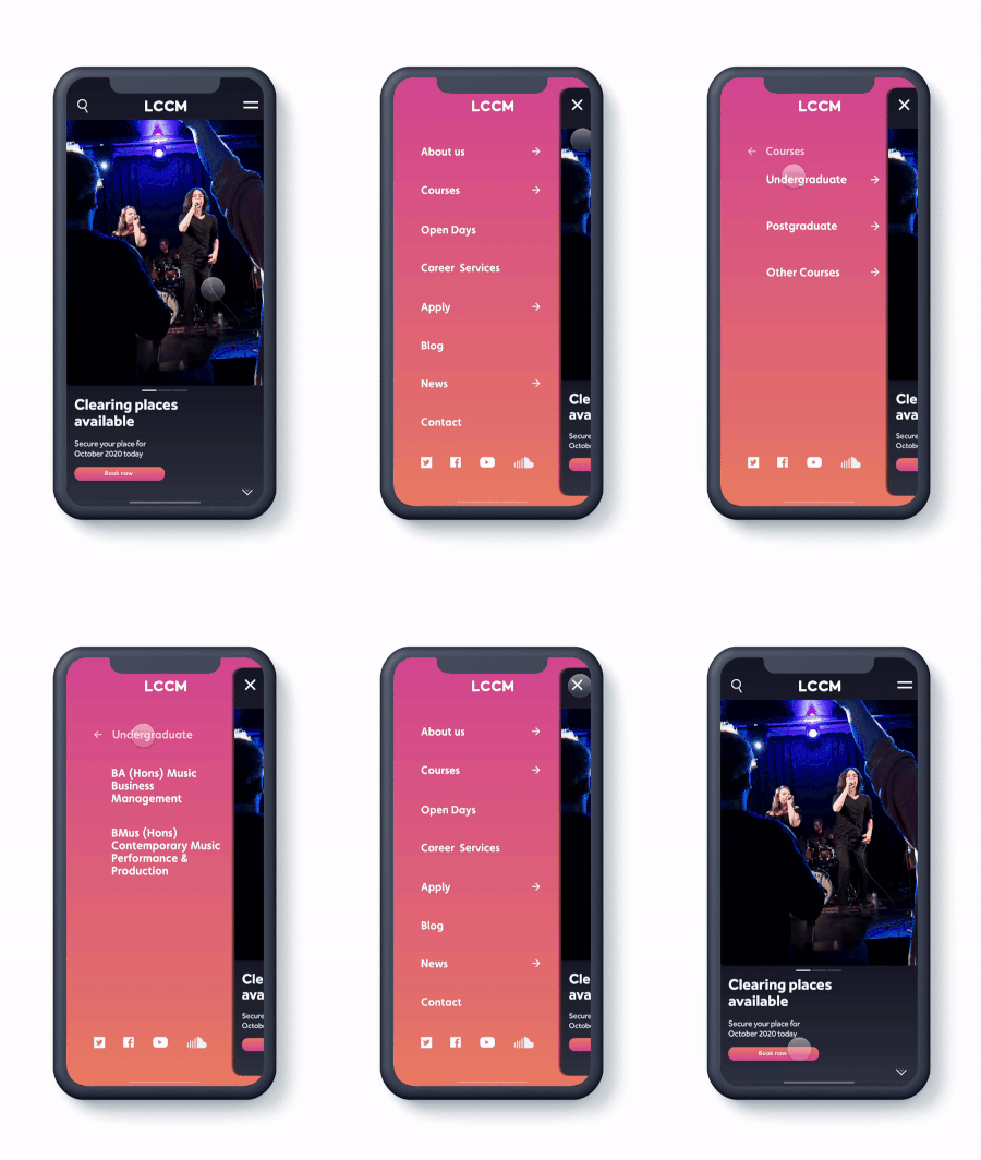
The menu options that are most frequently used are placed in a fixed header. My design goal was to avoid any barriers for the user.
A NEW SEARCH FEATURE
It should have better controls and functions to help users identify trusted merchants and authenticity.
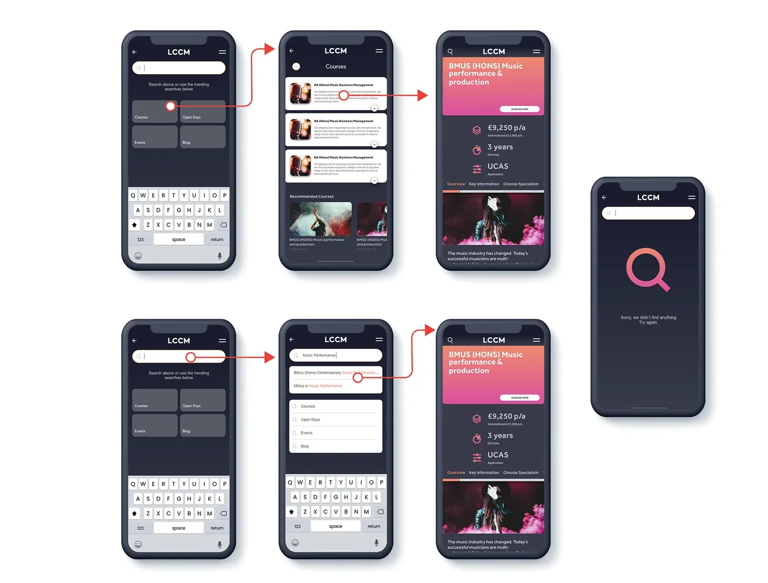
The new search tab is more convenient and friendly than the old design. Users can see the main search options with intelligent feature.
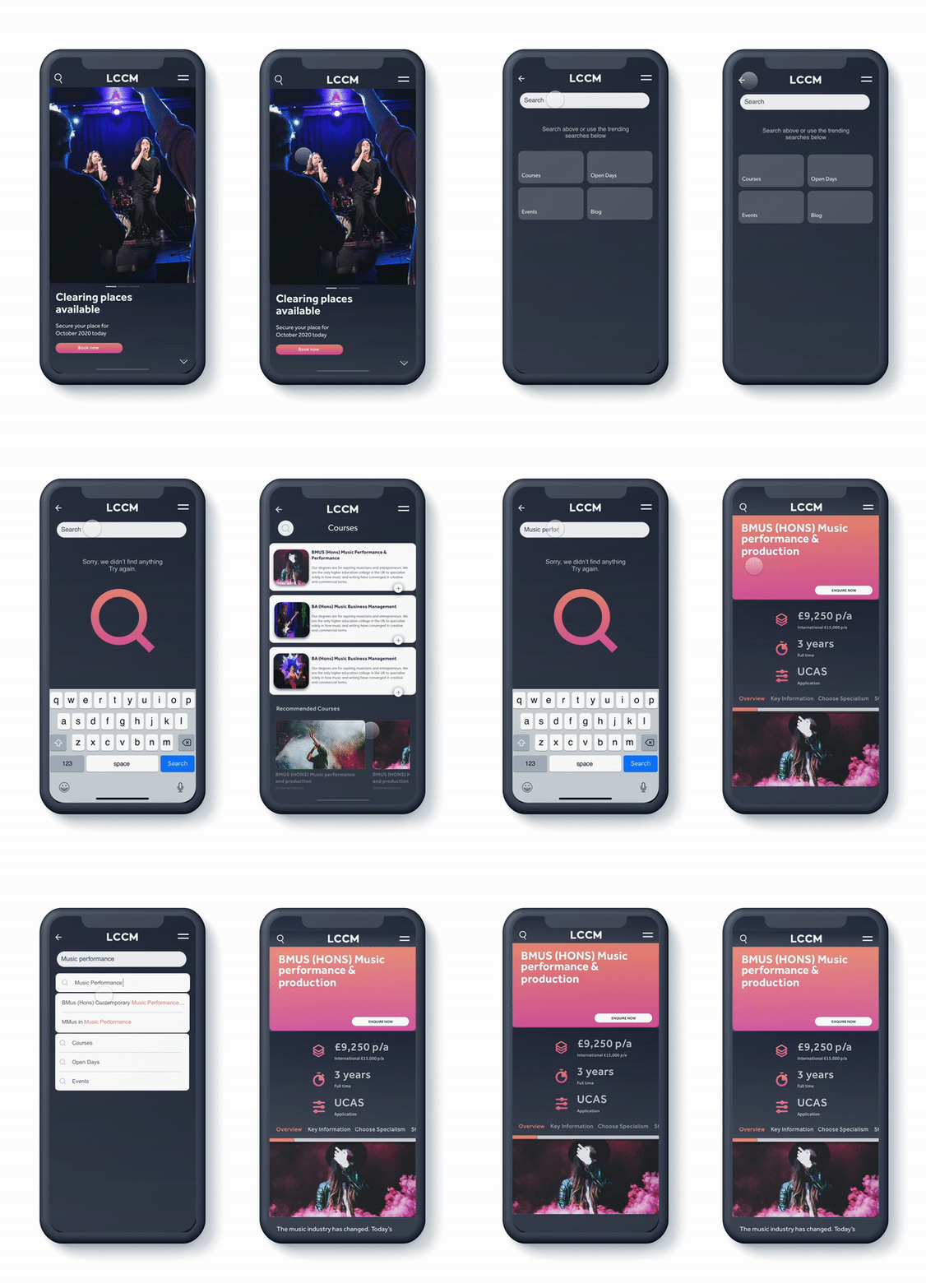
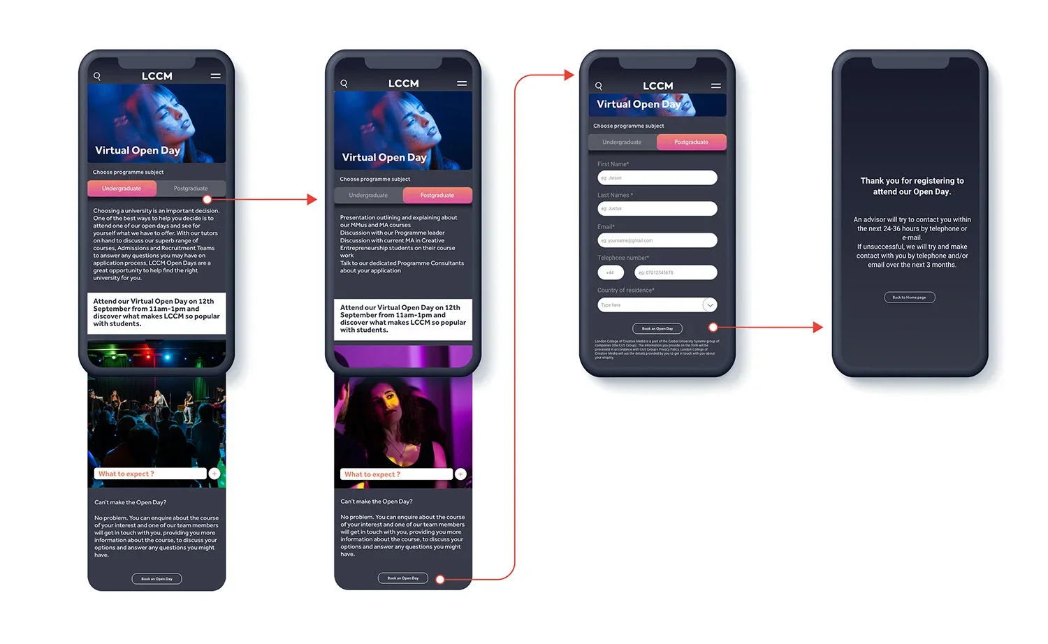
A FRESH COURSES & OPEN DAY FEATURES
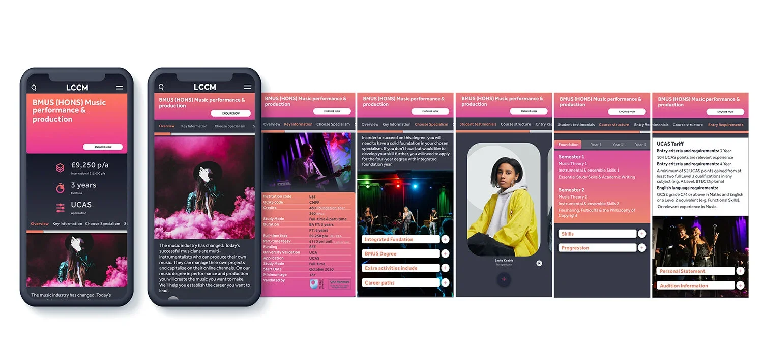
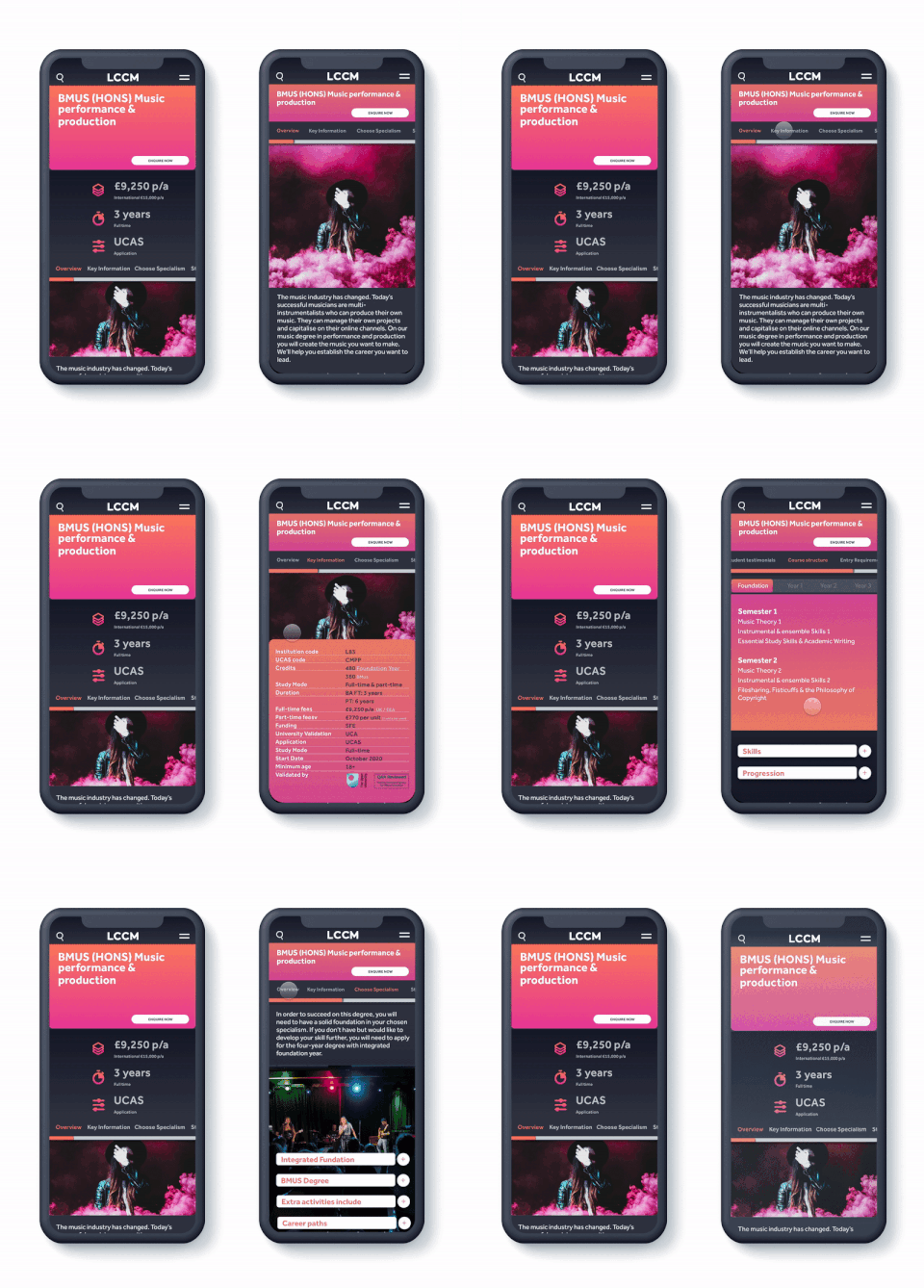
A brighter, more informative header gives context to prospective learners who are new to the field. The new design refocuses the experience around all the aspects in the same screen.
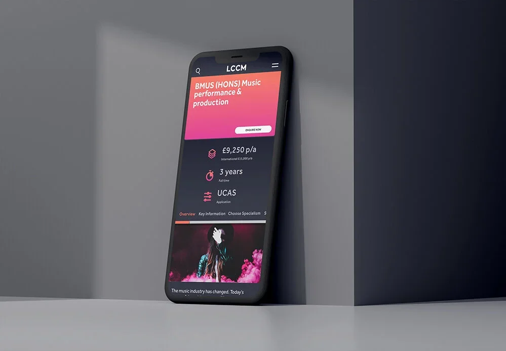
I increased the visibility and clarity of how much it will cost, how long it will take, if there are prerequisites, and what topics are covered.
Wireframes