LCCM
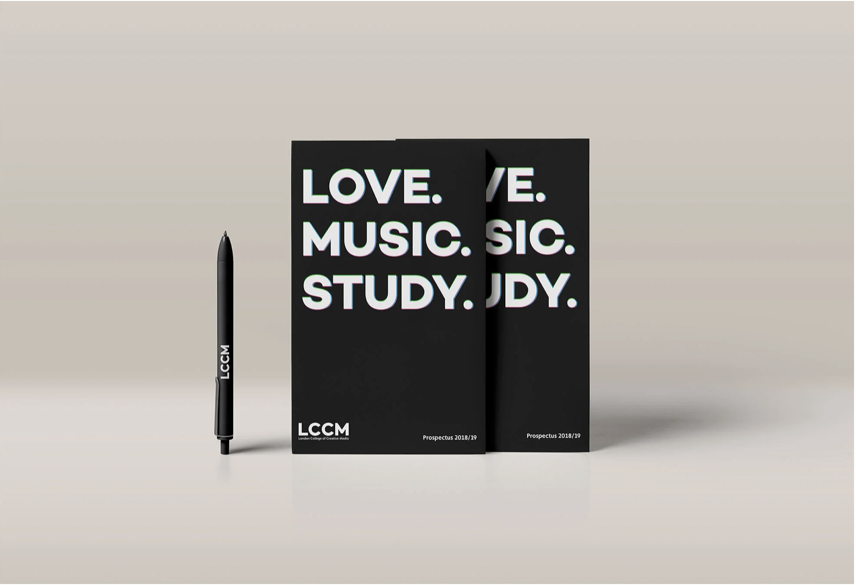
Prospectus 19.
For the LCCM prospectus, the cover was designed as a strong visual statement, using Soft Touch lamination to create a smooth, tactile finish. This was combined with blind embossing on the lettering, giving the title a physical presence that could be experienced through touch as well as sight.
Click here to see LCCM prospectus interactive
Visual Language
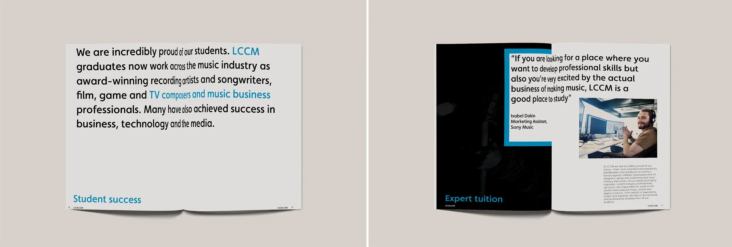
Inside the prospectus, the same visual approach continues through bold typography, strong colour blocks and a clear editorial structure. The corporate colour palette becomes a navigational tool, helping to organise information while reinforcing the LCCM brand throughout the publication.
The combination of large type, photography and generous areas of negative space creates a modern editorial aesthetic while keeping the content accessible and easy to navigate.
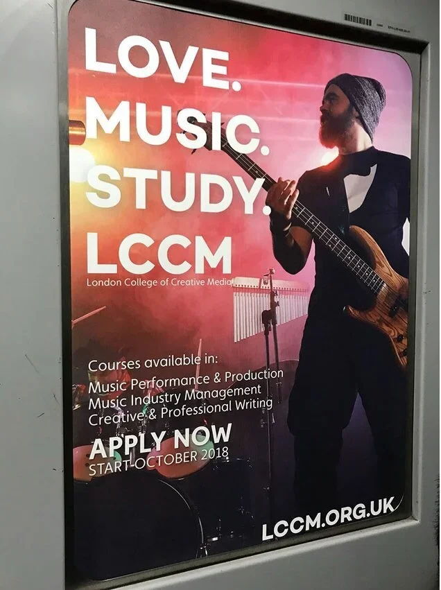
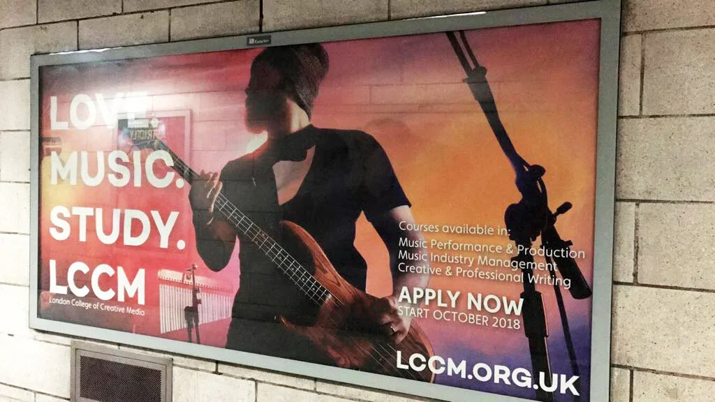
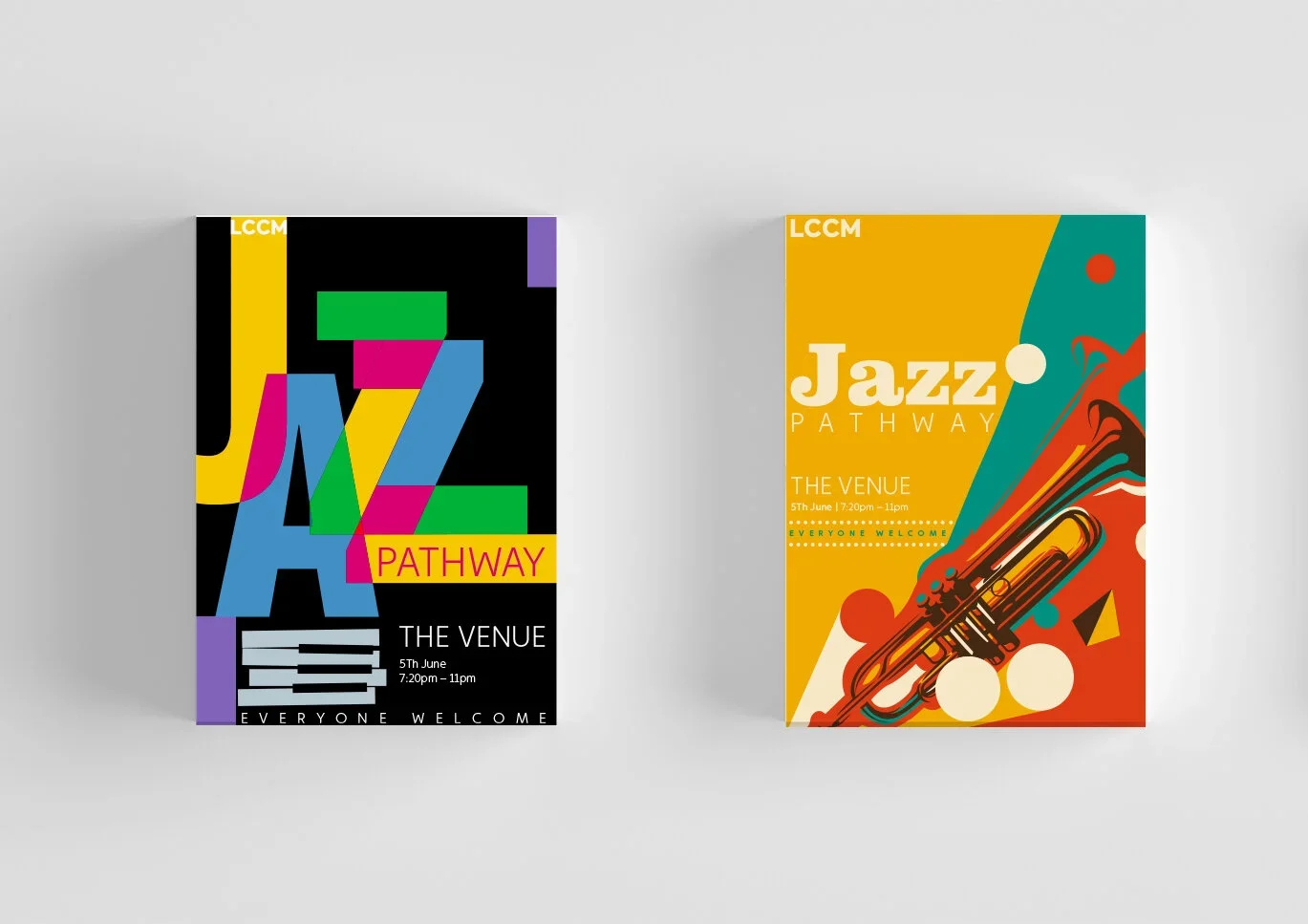
External and internal Poster
Merchandising
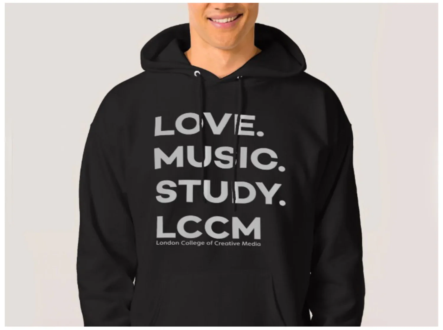
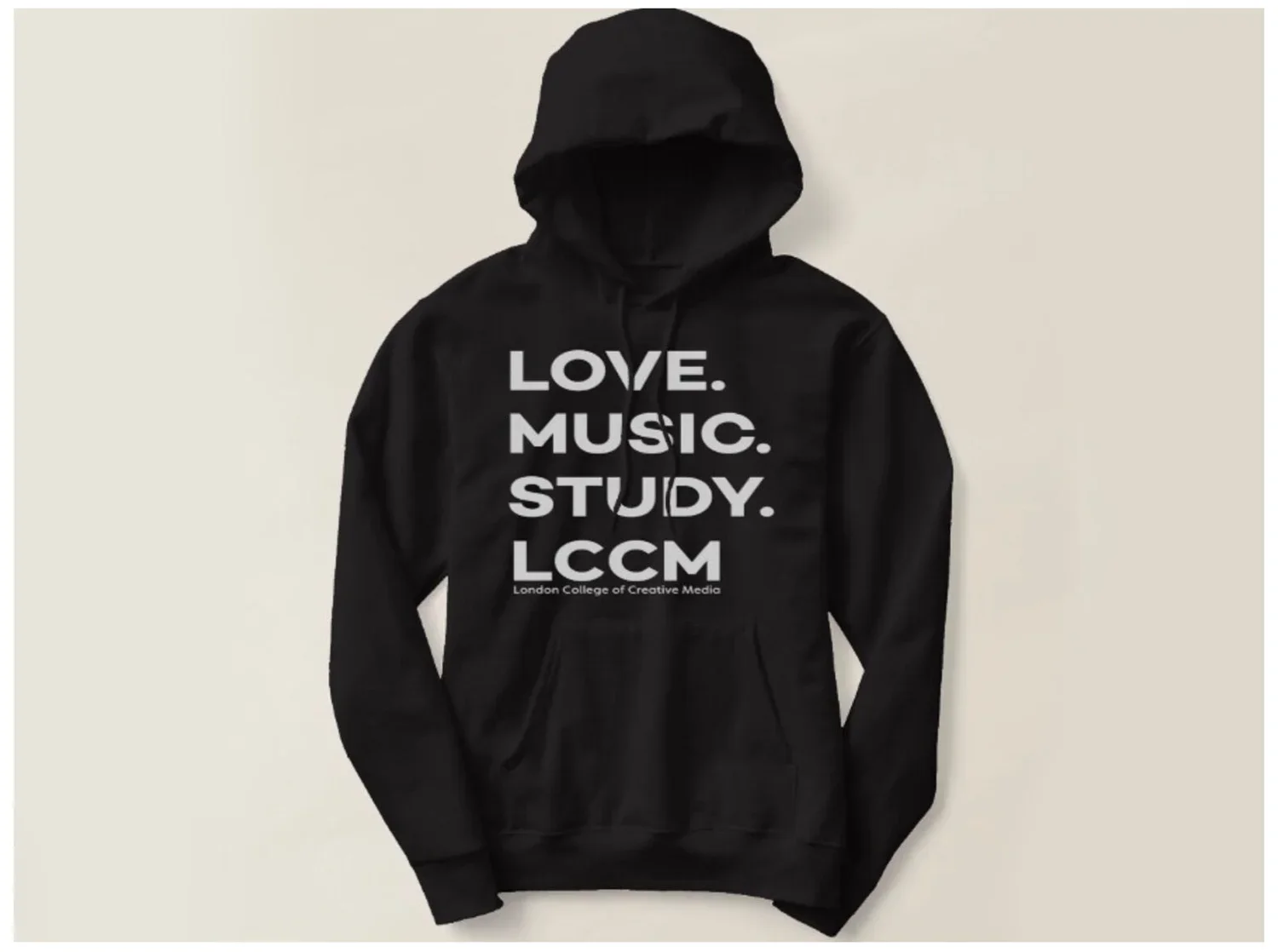
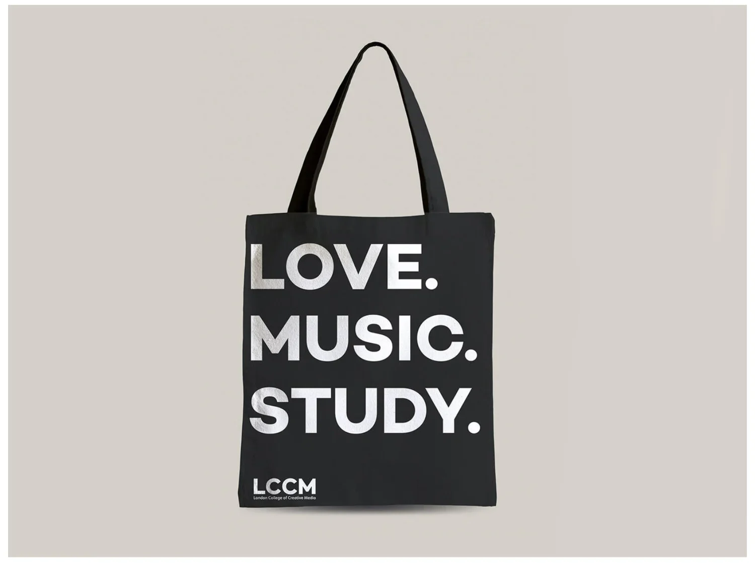
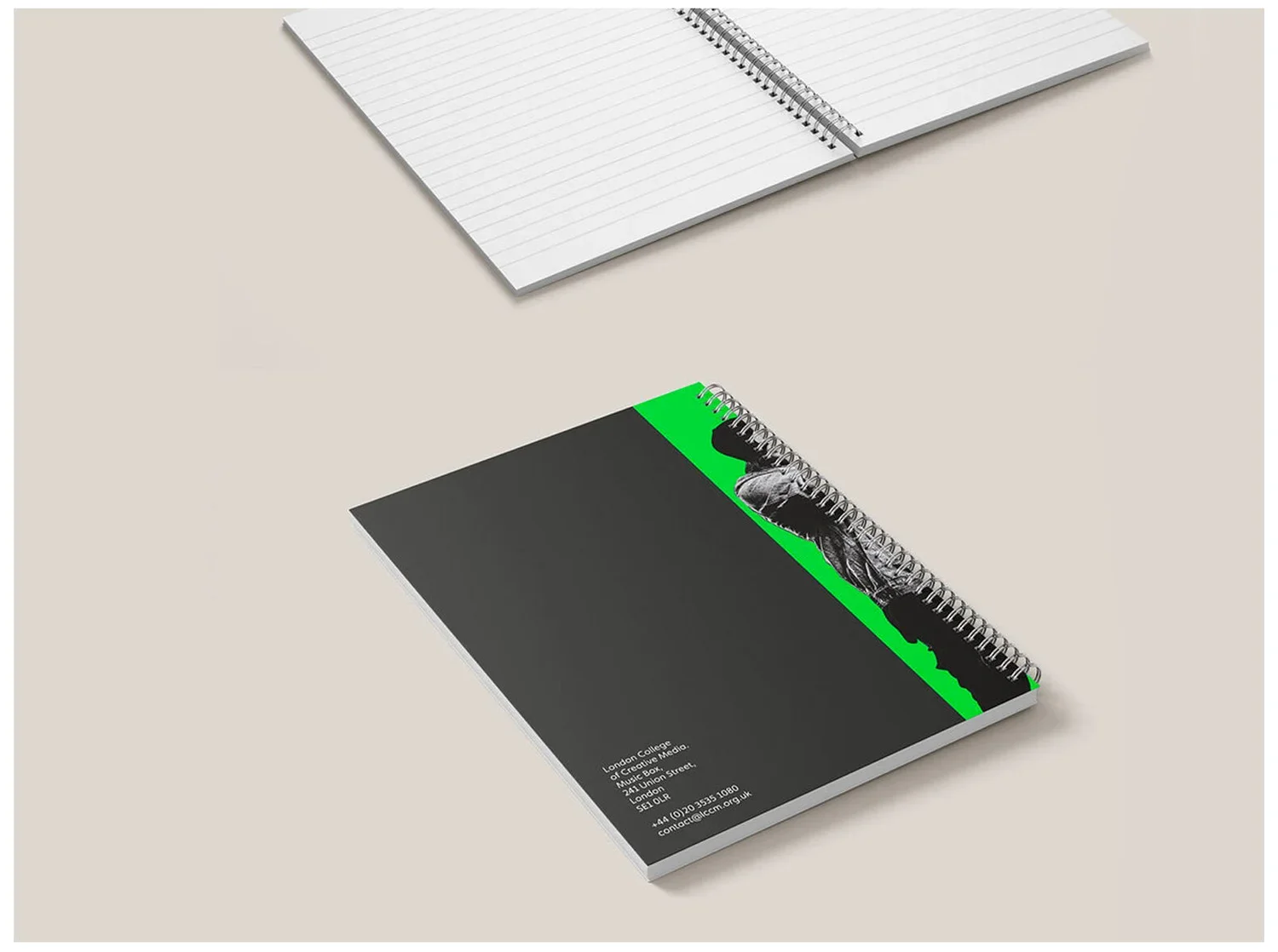
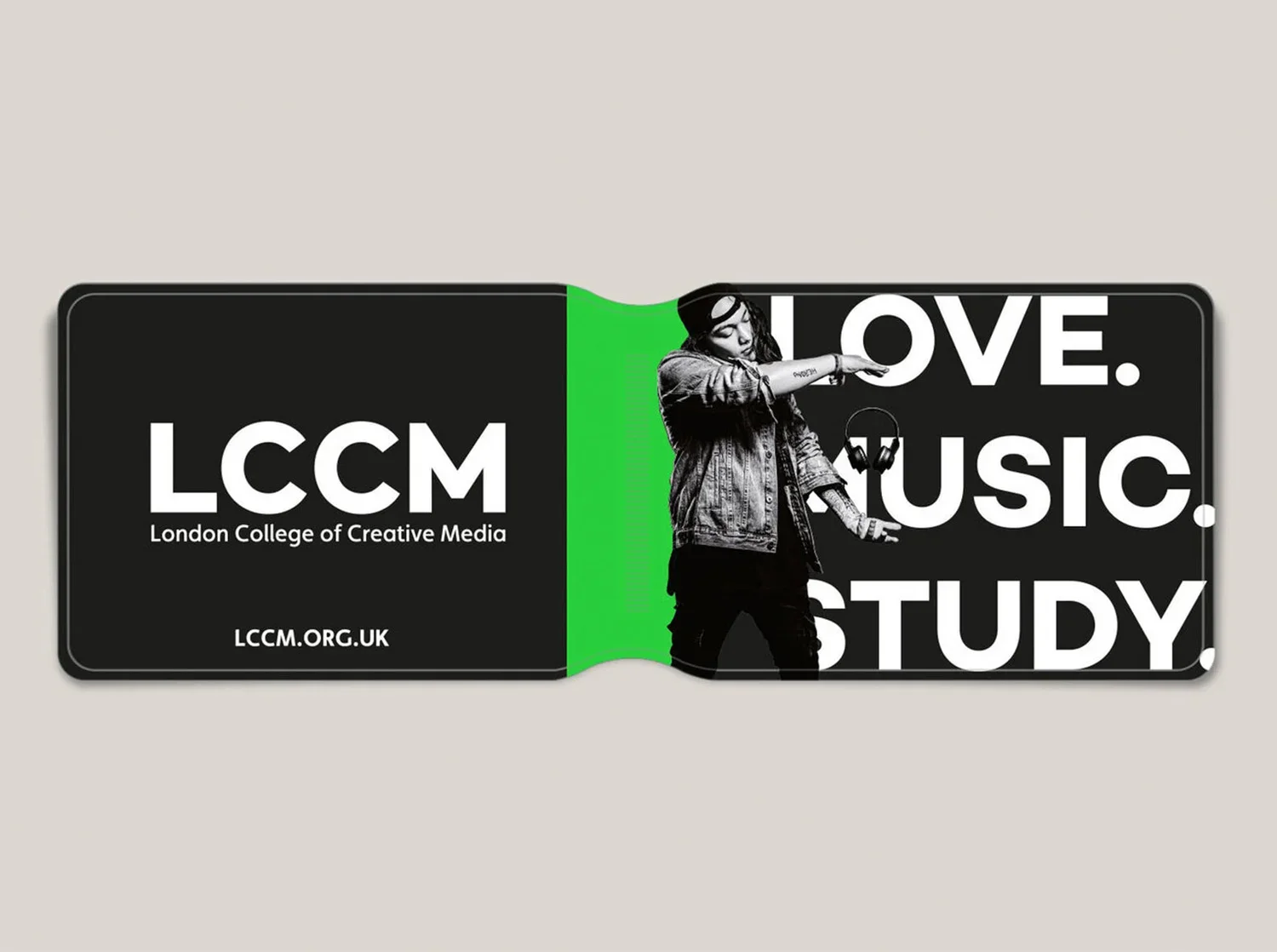
I have been tasked and responsible for designing and providing a huge array of promotional material such as huddles, tote bags, notebooks and oyster, pens.
Outdoors
I have been tasked with the development of videos to promote LCCM events even more enhanced level with the audiences we wish to engage.
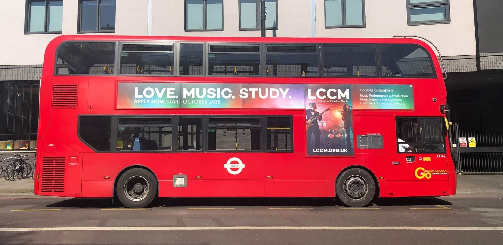
For the first time in LCCM’s history I was tasked with and responsible for the creation of our first ever campaign to promote LCCM courses on buses and on the London Underground.