BSBI Rebranding
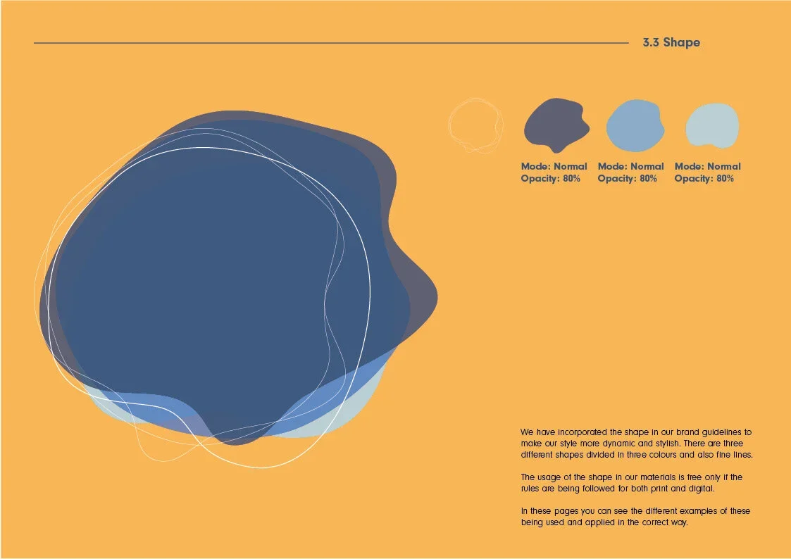
Brand guidelines.
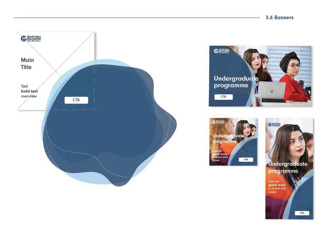
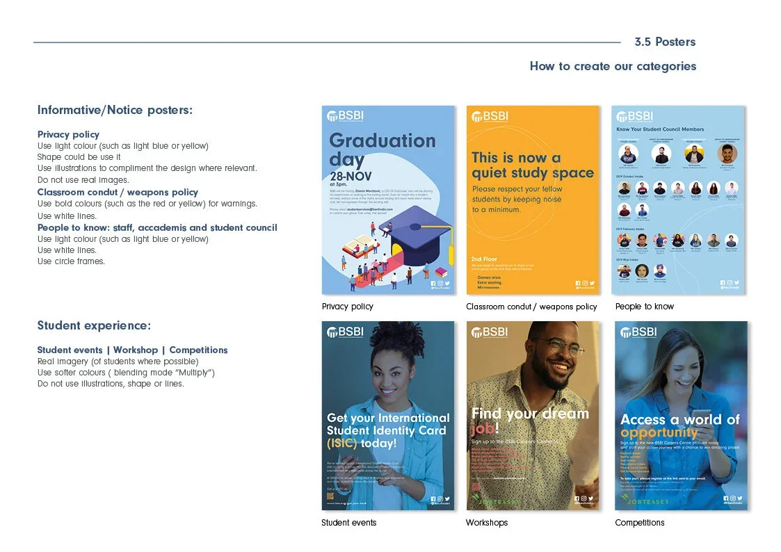
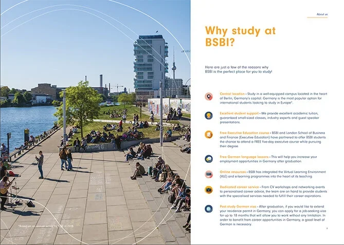
We set material layouts with typography, spacing, and sizing all called out. We also gave them examples of how the typography and layout could work on social media graphics. Easy guidelines that make creating content a cinch.
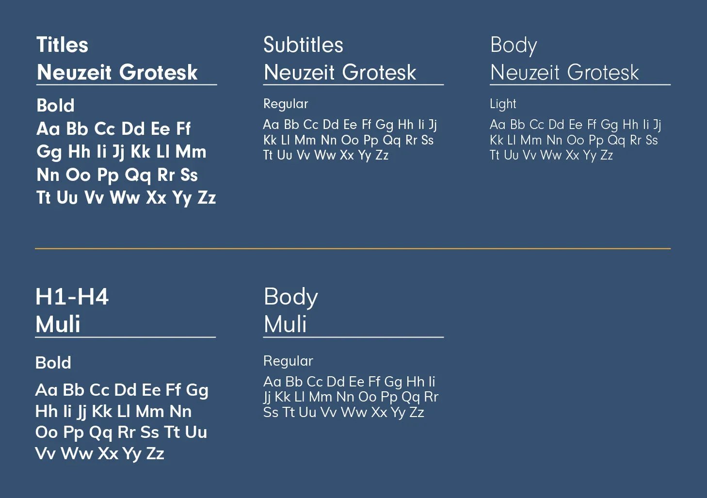
We chose Neuzeit Grotesk
This is a non-serif round font which we chose to provide a completely different look and feel to the brand , something which appears to be more modern and which compliments the illustration technique we will be using across the brand. This will create a look which is more aligned with our new style.
BSBI’s brand ethos:
Before moving into production, I developed the project and prepared it for a Kickstarter campaign.
This required translating the creative concept into a complete presentation — from the product and visual communication to campaign assets and promotional content.
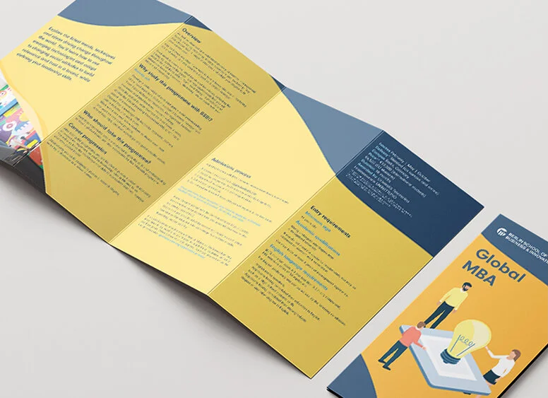
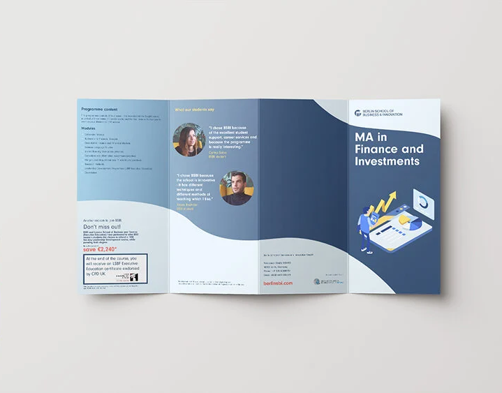
Refreshing our material
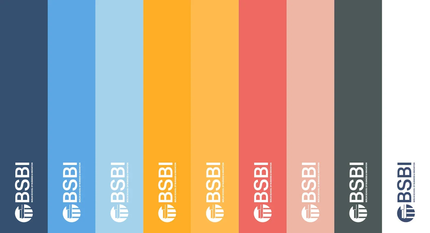
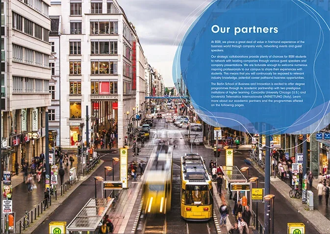
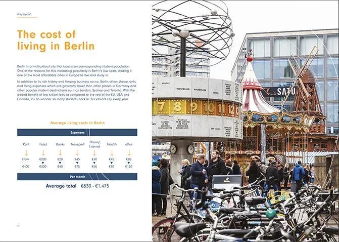
The principal idea behind the rebrand was to create a new concept, something that appears to be fresh and inspiring, which reflects the aspirations of our audience, who are younger adults, but also to reflect the essence of the location of our school based in Berlin – arguably Europe’s capital. We updated our colour palate to allow more flexibility when it comes to our designs and also to improve the overall print quality, increasing the saturation level and richness and making the documents appear more vibrant!
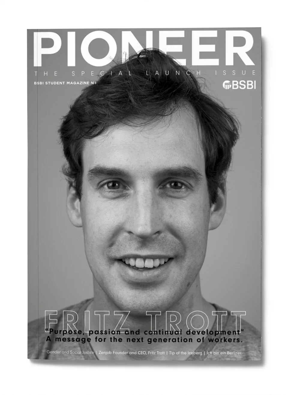
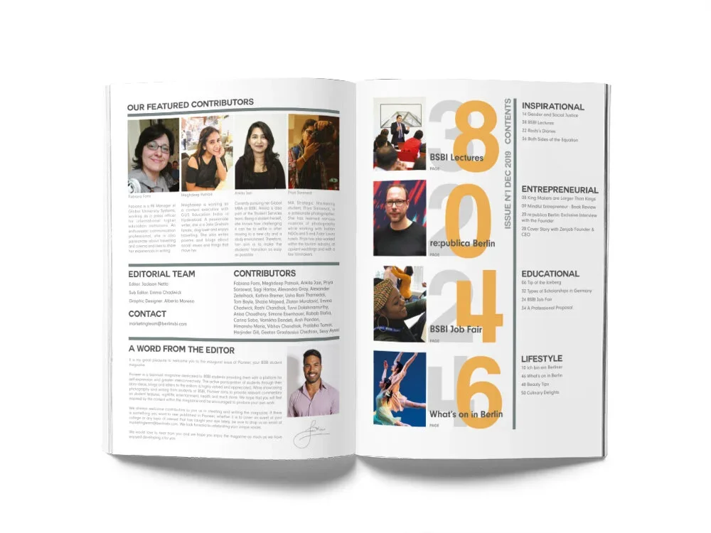
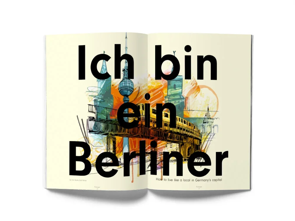
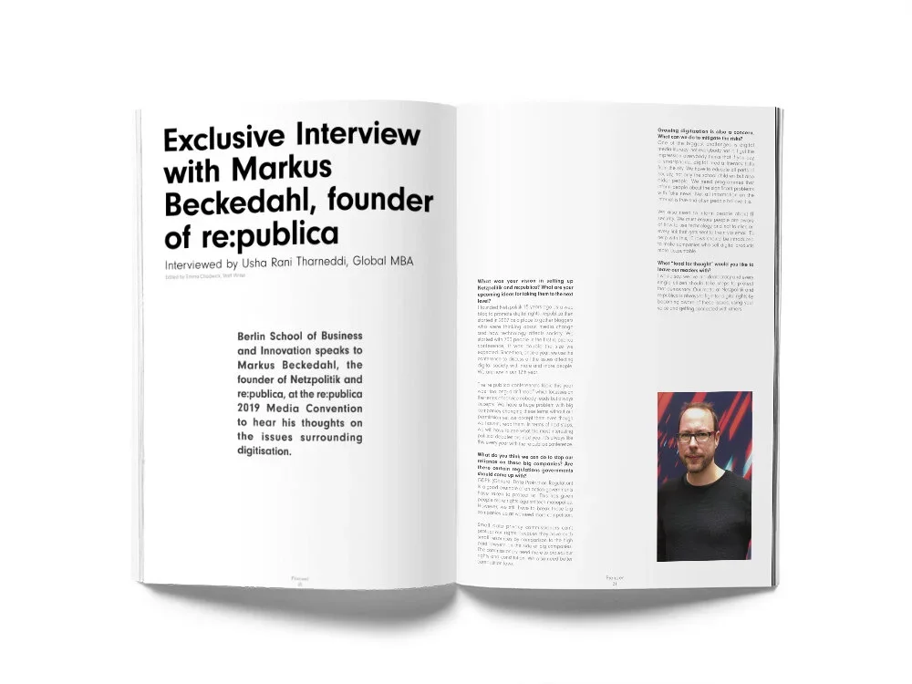
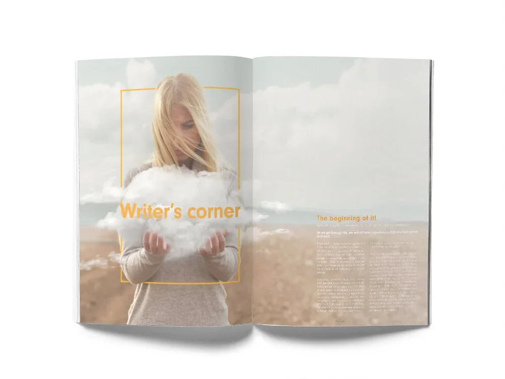
Pioneer magazine
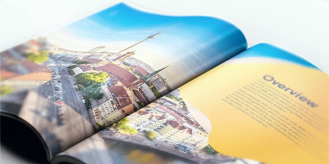
Pioneer is a biannual magazine dedicated to BSBI students providing them with a platform for self-expression and greater interconnectivity. The active participation of students through their story ideas, blogs and letters to the editors is highly valued, encouraged and appreciated.
I had the pleasure and privilege to create from the scratch the very first issue, to provide a conceptual magazine where both students and the professional could enjoy the journey, reading and discovering PIONEER.
See it online here