LCCA
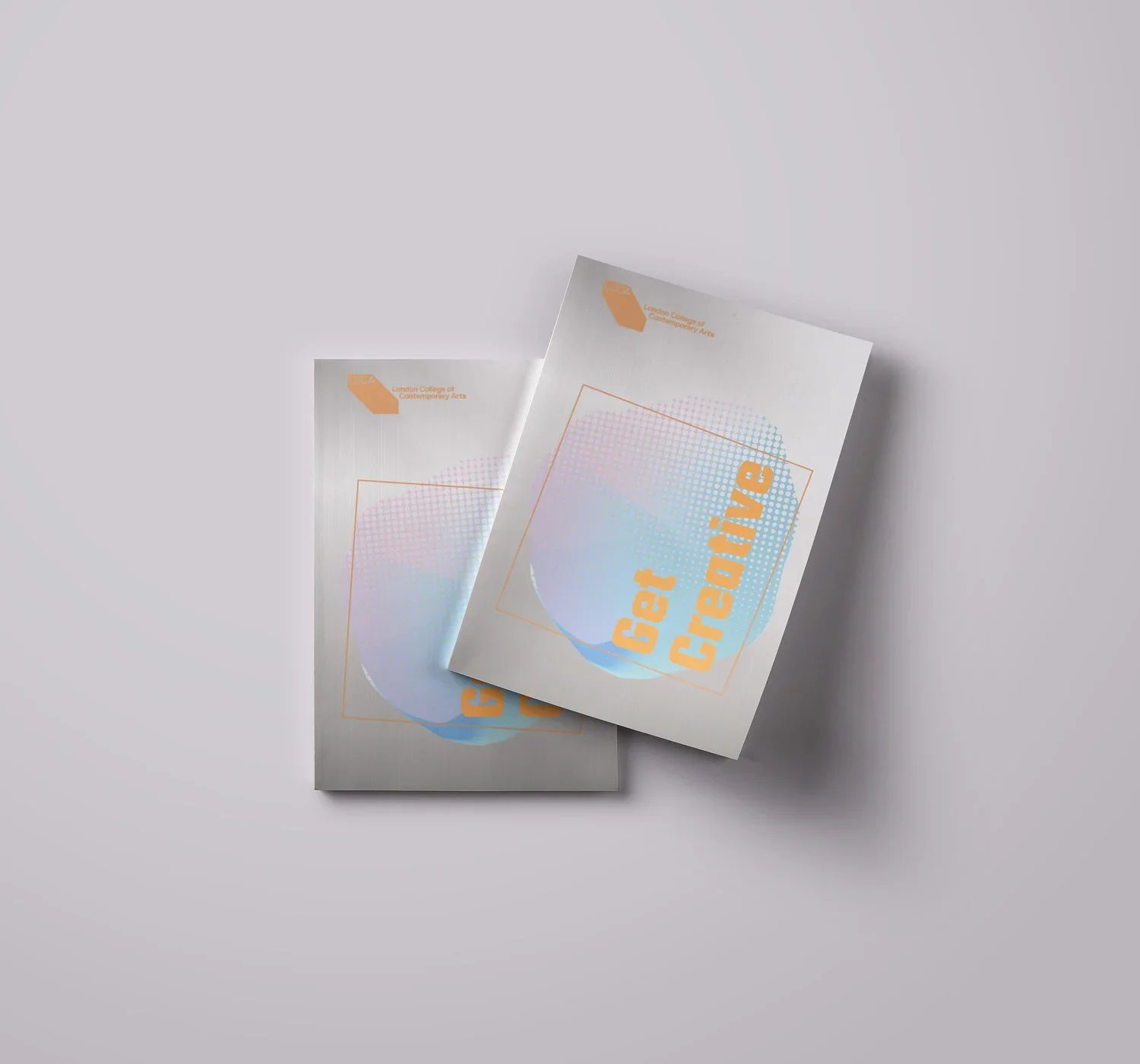
Prospectus 19.
The concept was built around a mirror-finish cover, using its reflective surface as an interactive element. The materiality of the cover was combined with a fluorescent orange spot colour, creating a strong visual contrast and giving the publication an energetic, contemporary character.
Production
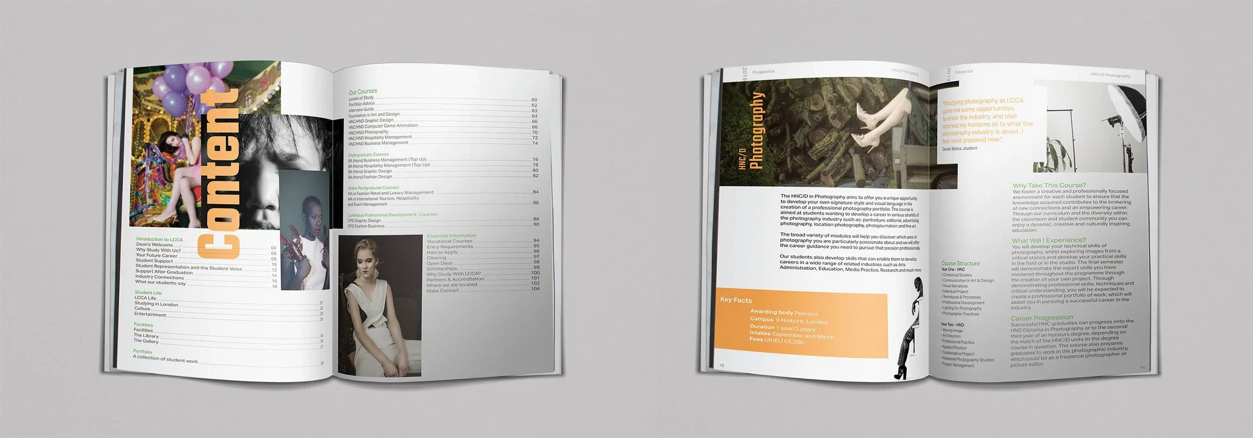
The prospectus was produced in London, working closely with the production process to ensure that the materials, finishes and colours translated accurately from the design concept into the final printed piece.
The combination of reflective material, fluorescent colour and embossed typography created an innovative physical object designed to attract attention within the highly competitive environment of university fairs.
Rather than functioning simply as an information booklet, the prospectus was conceived as a tangible expression of the LCCA brand — something designed to be noticed, picked up and remembered.
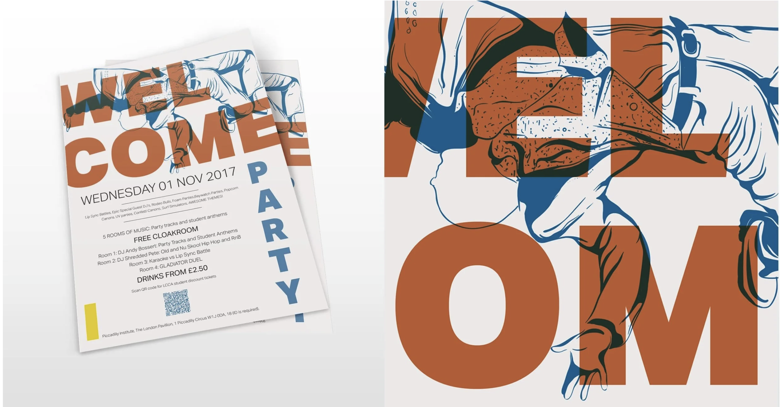
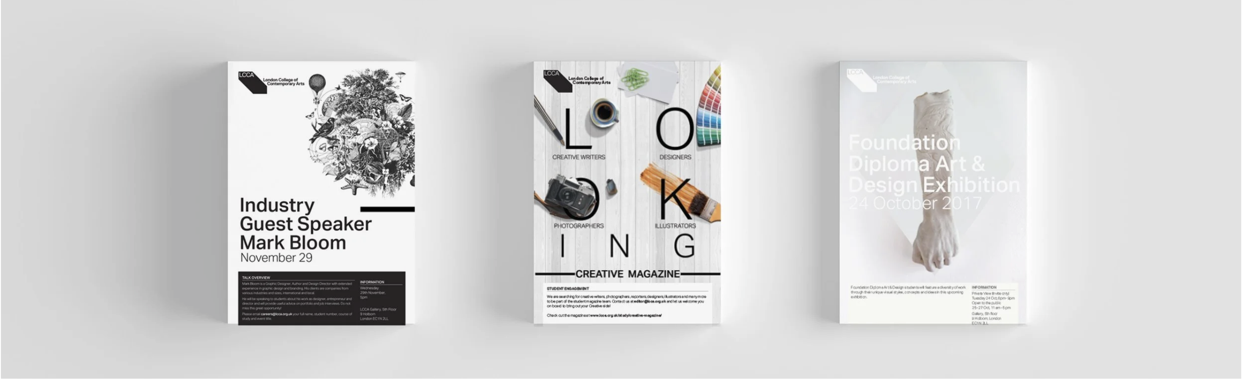
External and internal Poster
Creative Magazine
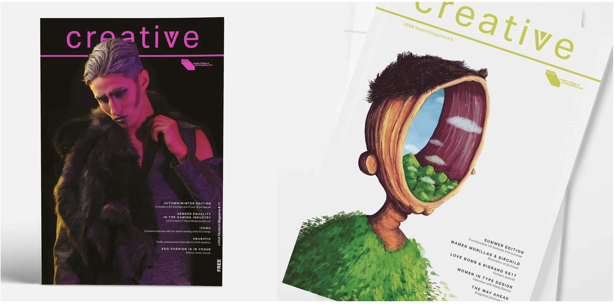
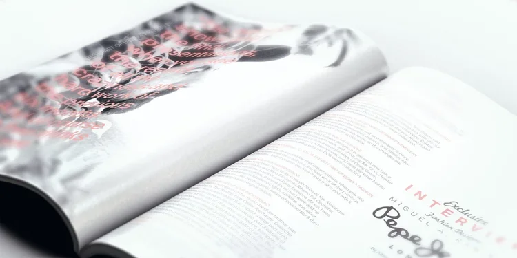
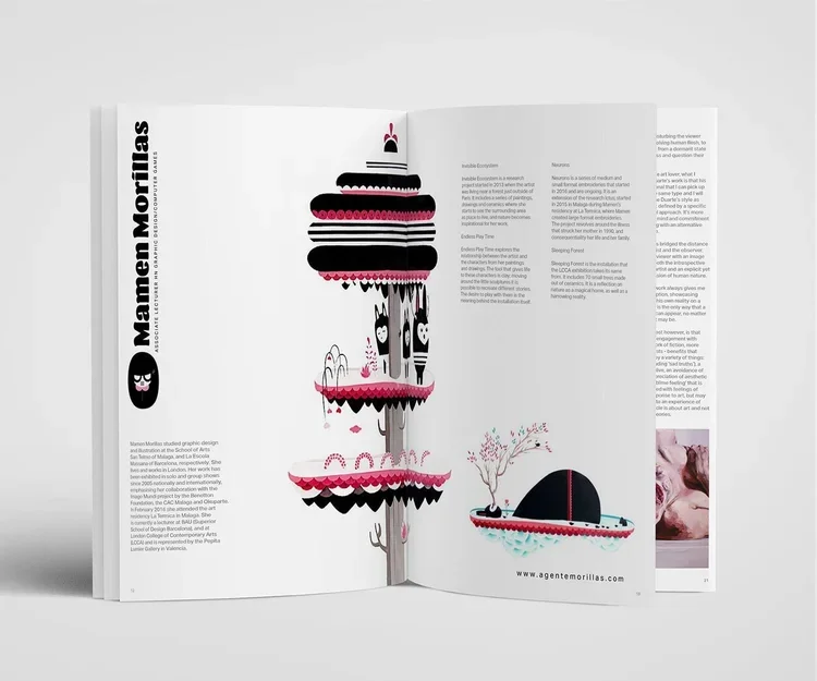
The Creative magazine is a space for students to be in tune with the art world, but it is also space for students to promote their own art and ideas.
Click here to see the latest issue of Creative Magazine
Website & Digital material
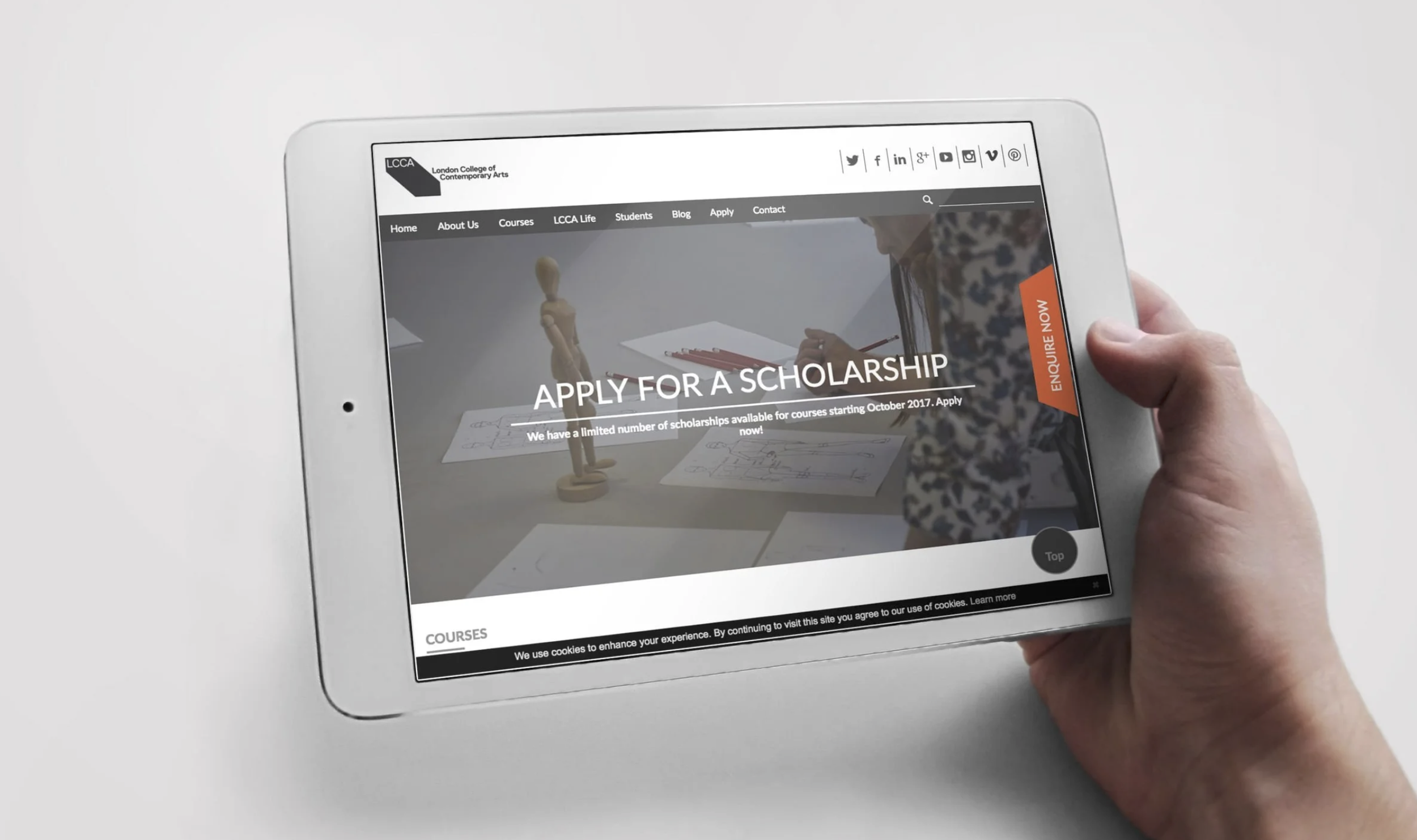
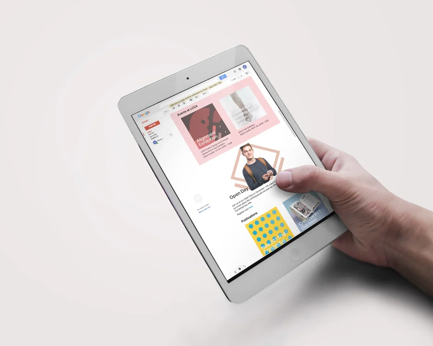
Much of my work is created from the scratch, starting with the brief, working in collaboration with third parties and finishes with the final sign-off, working directly and in close collaboration with development team, we attempt to also solve any issues or problems with the previous design:
Responsive. I adapt the new design so it works well on all devices.
Creative. Layout provides enhanced levels of functionality for Umbraco, helping to update the content for Marketing team.
Incorporate e-commerce and user login.